COLORS/PATTERNS
“What colors go best together?”
“What should I wear that photographs well?”
”Is there anything I should stay away from?”
Yes..
Yes..
And YES. Just YES.
These are without a doubt the few questions I get asked every single day. And boy oh boy have I got answers for you!
* Avoid heavy graphics and large logos. Busy graphics can take away from the focus (YOU!) and we don’t want that. There are always exceptions, like if you are sponsored and want to represent a specific brand - But typically these photos are for you and your family to have forever and hang on your wall.
* Avoid neon colors. And I say this gently, because I have many neon tops that I am in love with. But the unfortunate fact is that these just do not photograph well. Any bright and overly saturated colors don’t handle post processing well and can have a funky effect on the photo. These can even cast a color onto other outfits in the photograph. It’s best to ditch neon colors like orange, green, yellow, extremely bright reds, or anything dripping with saturation. An easy fix for this is to replace the tone. Love the red color palette? Find a burgundy or a darker red instead of a vivid neon red. Swap out the neon green for a timeless forest green.
* Avoid too many clashing patterns. Set the polka dots down and step away from the plaid! Just kidding. Kind of. Patterns can be great with a minimalist approach. Have the entire family wear complimentary colors and throw Tommy in that adorable shark pattern shirt you’ve been dying to have him in! When it comes to clashing, I always say that it’s best to avoid too many patterns in one photo. You know what I’m talking about. One person shows up in plaid, the other in stripes, kids are in polka dots. And hey, I’ve photographed this scenario before and can still make it work but it’s not ideal. If there is too much going on, it really does take away from the subjects of the photo. Mommy/daughter or Daddy/son matching is always an option and never fails. That combination will always be adorable.
I could go on for days about this topic but I think my fingers would be numb.
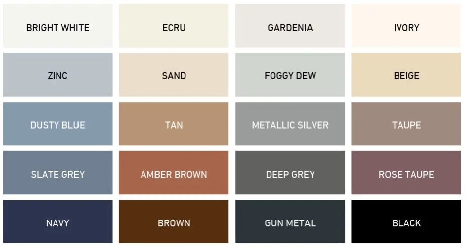
* If you are struggling, stick to neutral colors! Say it with me. Neutral colors are friends not food. Finding Nemo? No? Just me? Awkward.
I’m not kidding you. Neutral colors can save the day when you are stressed about having everyone match. Pick a few of your favorite colors, find your closest Target, and treat yourself. This is a fail proof solution that works 101% of the time. If you want to do a bright pop of color, have that be fixed outfit and fill in the remaining outfits. You can choose shades of gray, brown, etc. or a color that compliments the brighter color without taking away from the photo.


